Simplifying hologram creation for beta release
2021-2022
Startup
Windows software
Context
Holotch is a Japanese startup specializing in hologram software. Their tool for creating holograms with Kinect was functional but designed for internal use, making it too complex for external users. As the sole Product Designer in a team of seven, my role was to transform this tool into an accessible product for clients and stakeholders.
Challenge
To make it publicly usable, the interface and user flow needed a complete redesign to abstract technical complexity.
Adding to the challenge, the software was built with Dear ImGui, a minimalistic user interface library with limited customization options. This meant the new design had to work within strict technical constraints.

My approach
I first identified user expectations and technical constraints, working closely with the CTO to simplify the software’s existing workflow.
I then redesigned the interface into a streamlined five-step process. Finally, I conducted usability tests to validate the new design and iterated based on feedback.
Outcome
The redesign transformed a developer-dependent tool into a usable product, giving the startup confidence to launch its first beta release. This release increased the number of clients from 6 to 10—a significant 67% growth for the startup.
With half of the client base showing interest in the software, Holotch was able to diversify its services—expanding from solely tailored solutions to also offering the software as a product.

Detailed Design Process
Clarifying the need
The software’s complexity conflicted with Holotch’s vision of “holograms for everyone”. I facilitated discussions with the team to define a minimum viable experience for a public release.
The distinction between tailored solutions and self-service creation was crucial in defining the redesigned software’s requirements. We aligned on a core priority: making hologram creation quick and accessible.
Mapping and simplifying the user flow
To understand the software’s limitations, I initiated deep-dive sessions with the CTO.
We listed user actions involved in the current process, which I translated into a user-flow diagram on FigJam for better visualization.
Using this as a foundation, we co-created a simplified flow, breaking down the process into five sequential steps.
Instead of overwhelming users with settings, we introduced smart defaults.

User flow for creating a hologram
This structured approach helped uncover redundancies and revealed that several manual steps could be automated or eliminated, reducing friction for new users. To further refine the experience, we translated the new user flow into wireframes on FigJam, ensuring clarity before moving into high-fidelity design.

Wireframe samples co-created on FigJam
Designing the new interface
Given the constraints of Dear ImGui, I kept the UI simple and structured:
Progressive disclosure: Each step focused on a single action to reduce cognitive load.
Kinect feedback at every stage: Users always had a real-time preview of what would be recorded.
Concise guidance: Brief explanations guided users through each step of the process.

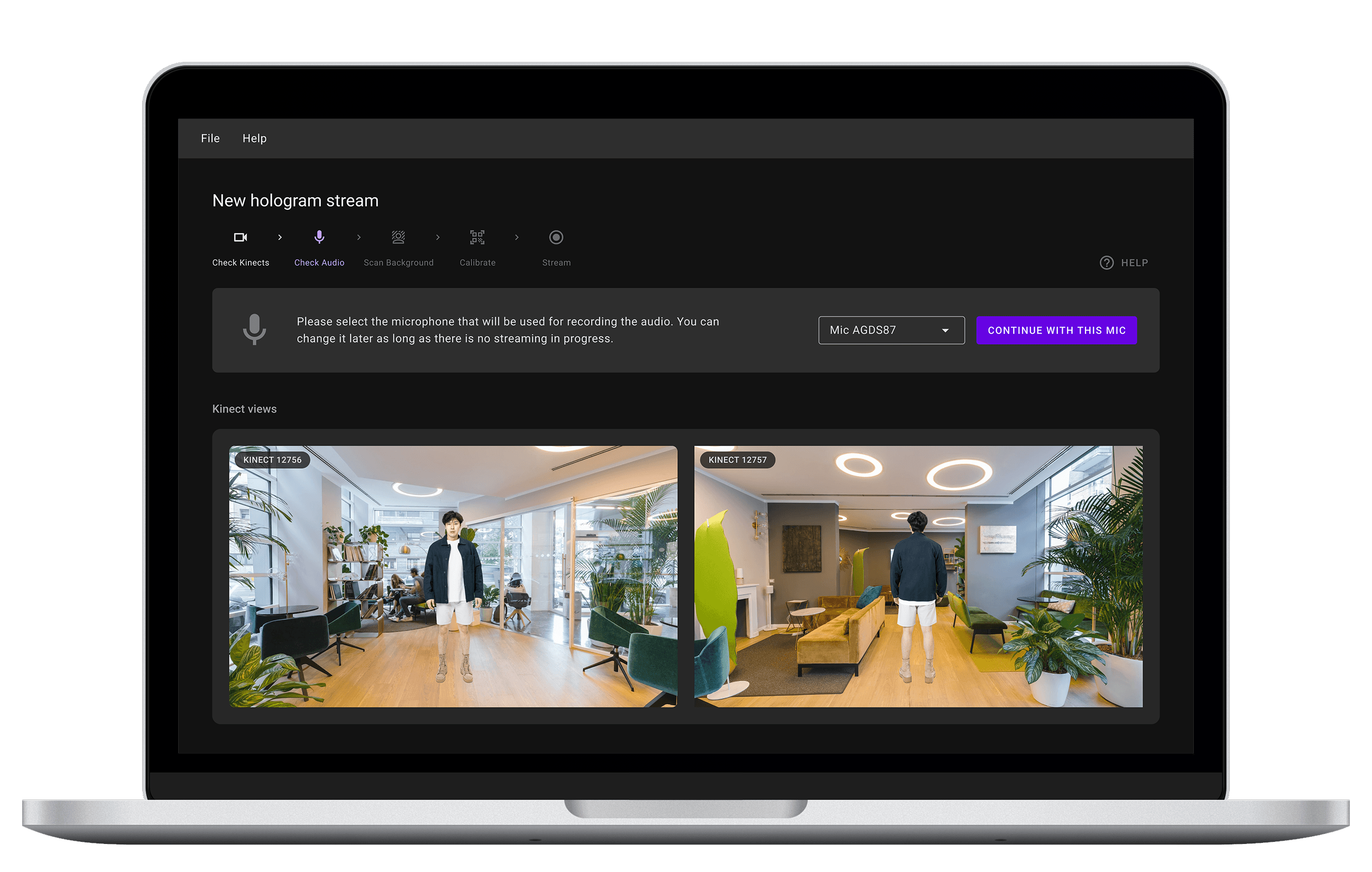
Redesigned software interface
Documenting & testing
I built an interactive prototype, which the team validated before implementation. However, given time constraints and the importance of Kinect feedback and scene setup, I prioritized testing on the implemented version rather than the prototype.
Before user testing, I conducted internal tests to refine the experience and document the process with simple illustrations for clarity.

Illustration samples from documentation for setting up Kinects and the recording scene
The usability test focused on one core task: live-streaming a hologram.
Think-aloud protocol encouraged users to describe their thought process.
Short interviews followed each session for further insights.
The CEO facilitated sessions for Japanese-speaking participants, while I observed.
After two sessions, a serious usability issue emerged: setup was more challenging than expected, and users ignored the PDF documentation. This insight led us to rethink onboarding.
Refining
Setting up the recording scene emerged as the biggest pain point. Users struggled with Kinect positioning and calibration, and testing revealed that placing the ArUco marker (a printable PDF) was not as intuitive as expected.
To address this, I identified a quick win by adding clear orientation instructions directly on the marker itself, removing guesswork.

Updated printable marker with instructions directly on the sheet
To further improve guidance, I refined the software by:
Embedding contextual guidance directly into the interface, eliminating reliance on external documentation.
Surfacing visual instructions at the exact moment users needed them.
Testing the updated version confirmed a significant usability improvement, giving us confidence to launch the first beta release.
Interactive prototype preview showing initial steps of hologram creation
Reflections & key learnings
What worked well
Clarifying user needs early ensured the right focus.
Close collaboration with the CTO helped navigate technical constraints.
Fast iteration cycles allowed quick validation and refinement.
What I would do differently
I wouldn’t assume users will read documentation—even for hardware setup. Instead, I’d integrate onboarding guidance directly into the interface from the start.