Boosting restaurant sales with a self-ordering kiosk
2019
Startup
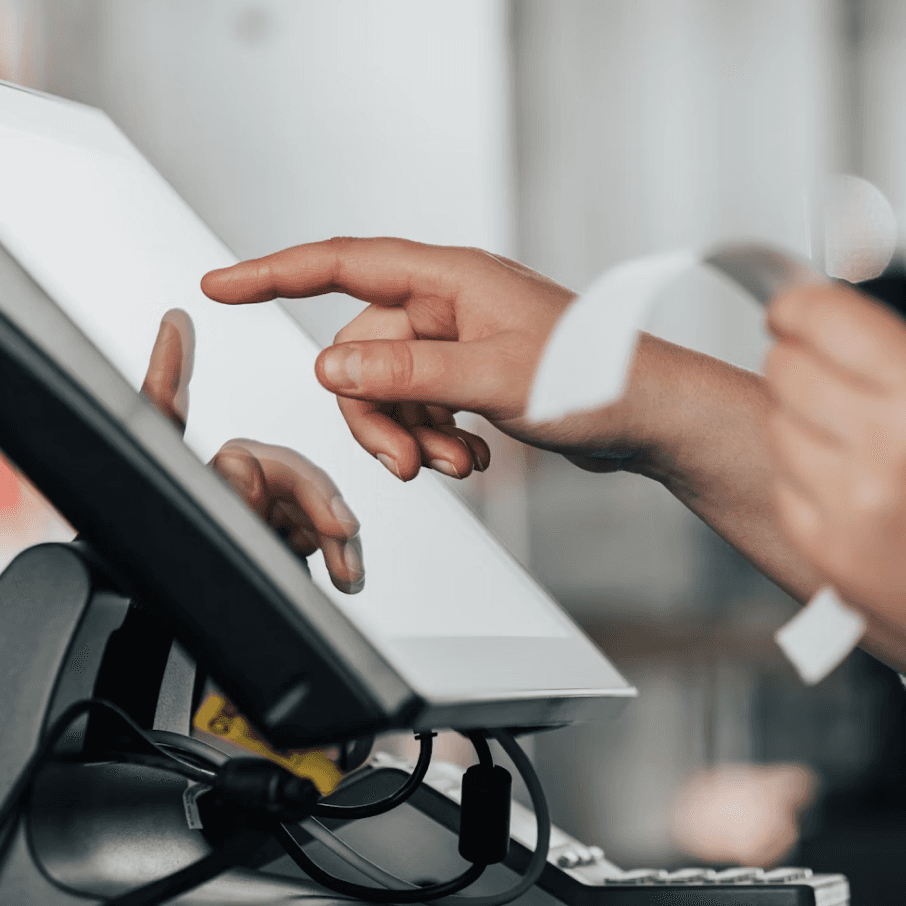
Self-ordering kiosk
Context
Symbioz is a startup that provides software and hardware solutions to help restaurants optimize order management, streamline kitchen workflows, and reduce customer wait times.
A fast-food restaurant partnered with Symbioz to introduce a new self-ordering kiosk, which I had the opportunity to design from the ground up.
Challenge
The project came with tight time and budget constraints, requiring a fast and effective design process.
Symbioz also wanted a user flow and interface that could be reused across various clients—not just the initial restaurant partner.
My approach
To meet the constraints, I led a Design Sprint methodology. This allowed us to produce a functional prototype in about five days, while actively involving the Symbioz team throughout the process.
Outcome
The prototype created and tested at the end of the sprint formed the foundation of the kiosk’s first release just a few weeks later.
It proved to be a valuable tool for saving time and boosting sales—not only for the initial fast-food partner but also in a variety of settings, including bars where it was used for ordering snacks and drinks.
* From Symbioz’s website and Instagram (2 years after launch)


Final design template for the self-ordering kiosk
Leading a Design Sprint
Preparing the sprint
I ensured the availability of the sprint team, which included the Symbioz co-founder, a developer, a UX designer, and myself as facilitator. I handled logistics—booking a room, gathering materials, scheduling team meetings, and arranging on-site visits to the restaurant for research and testing.
Before the sprint officially began, I conducted user interviews with 10 customers at the partner restaurant. Key insights included:
Most customers were already familiar with kiosks from fast-food chains like McDonald’s.
They valued skipping the queue and appreciated time to explore menu items in detail.
Some customers arrived with a clear idea of what they wanted to order, while others preferred to browse.

On-site user interviews conducted at the restaurant (Anonymized images)
Day 1: Map
We kicked off by defining the user goal and setting the scope for the sprint.
The co-founder gave a short talk to share the vision behind the kiosk. I then presented findings from the user interviews.
We collaboratively built a rough customer journey map on a whiteboard, then held a “How Might We” workshop to identify design opportunities. Each participant reframed pain points into opportunities, like:
How might we encourage users to buy more items?
How might we help users discover menus easily?
How might we support fast orders for users who know what they want?
How might we create a flexible design usable across restaurants?

Customer journey map sketched on a whiteboard

Google Calendar event for weekly design meeting
Day 2: Sketch
I asked everyone to research inspiring interfaces online and summarize three ideas that could influence our kiosk experience.
After sharing findings, I presented a benchmark of existing kiosks from McDonald’s, KFC, and Burger King to inspire our work.
We then ran a Crazy 8s workshop, focusing on two key screens: the homepage and protein selection (beef, chicken, veggie, etc.).
Each participant presented their sketches. We voted on the most promising ideas, then moved to the Solution Sketch phase. I prepared large sheets for life-size sketches of three key screens, helping us visualize interface structure and flow.

Sketching workshop progressing from small-scale to life-size sketches
Day 3: Decide
The team presented their solution sketches, followed by individual Heatmap Voting to highlight strong concepts.
We discussed the most promising ideas and held a final vote. The co-founder decided to follow the majority and selected a main concept to prototype, integrating additional elements based on the heatmaps.
I extracted key ideas from the sketches, organized them by category and priority, and facilitated team alignment on the user flow to prototype.

Key ideas sorted by screens and priority for the first release (tagged as V1)
Google Calendar event for weekly design meeting
Day 4: Prototype
Based on the agreed user flow, I iterated on wireframes to quickly validate ideas with the team, then built an interactive prototype in Axure RP.

Paper prototyping before transitioning to Axure RP
Google Calendar event for weekly design meeting
Day 5: Test
We deployed the prototype at the partner restaurant using a portrait-oriented screen to simulate the kiosk. I conducted 10 user tests with real customers.
Feedback was overwhelmingly positive. Only one participant struggled with the interface—and this person had a notably different profile from our primary target audience, highlighting an opportunity to accommodate edge cases in future iterations.
Testing also revealed a few small refinements that could make the experience smoother. For example, automatically advancing to the next step after a selection would reduce friction and streamline the flow.

Axure RP interactive prototype deployed for in-restaurant testing
Visual design
After the sprint, I collaborated with another designer to refine the interface. I focused on layout and interactions, while my design partner worked on the graphical design aspects. We used a neutral color scheme—white and gray for backgrounds and text—so restaurants could easily customize the kiosk with their own accent colors.


Visual design of the self-ordering kiosk homepage
Reflections & key learnings
What worked well
Spending informal time with the team (e.g., having lunch together at the restaurant) helped build trust and made collaboration smoother.
Conducting both user research and user testing helped us stay grounded in real customer behavior and needs.
What I would do differently
This was my first time facilitating a full design sprint. I struggled to keep sessions on schedule and sometimes found it difficult to contain the team’s creative energy—which, while a good sign, meant working extra hours to stay on track.
Next time, I’d invest more time upfront in workshop planning to better frame activities and keep sessions within the intended time limits.

