Enhancing core features for a seamless experience
2023-2025
Startup
Web & mobile app
Context
SorareData helps tens of thousands of monthly active users excel in Sorare—a fantasy sports game—by providing football player analytics and market data. By the time I joined, both the web and mobile apps had evolved over two years, continuously expanding to meet user demands.
Challenge
As the product grew, so did its complexity. Every new addition made the experience richer but also harder to navigate. Key features became overwhelming due to repeated content expansions, while some secondary features went unnoticed.

My approach
To simplify the experience, I relied on usage analytics, user research, and navigation patterns to refine information hierarchy. Based on the context and roadmap, I pushed for major updates or incremental improvements, adopting a mobile-first approach where relevant to ensure cross-platform consistency.
Outcome
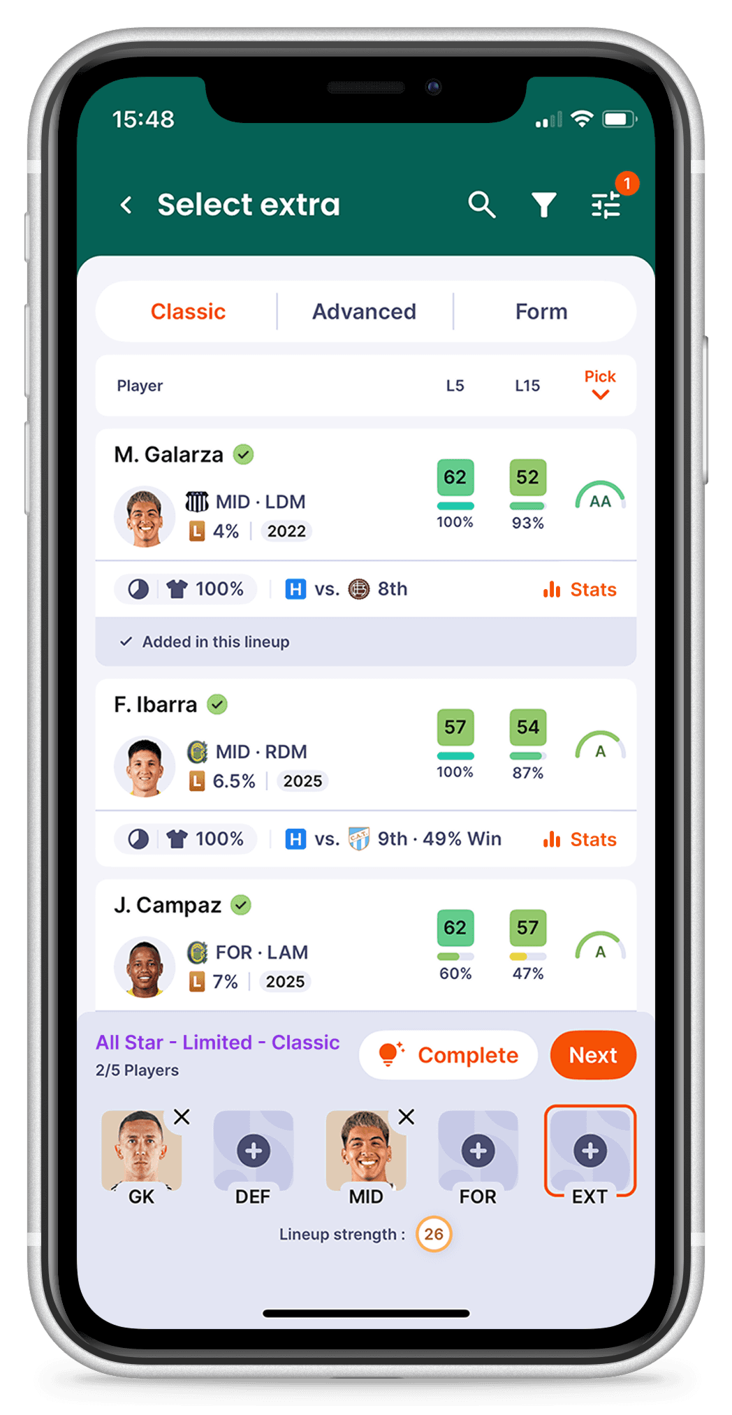
Driving engagement of the Lineup Builder
The lineup builder is one of SorareData’s most valuable features, particularly for paying users. I played a key role in designing its mobile version and led continuous improvements across both web and mobile over two years.
This work significantly increased adoption, resulting in hundreds of thousands of lineups created each week and a notable impact on user engagement:
*These metrics reflect two years of continuous improvements to the feature across web and mobile.


Improving the mobile Gameweek Center for better situation awareness
The Gameweek Center was the most visited page on SorareData’s mobile app, with Sorare results and Games data accounting for more than 60% of daily traffic (over 200K daily sessions).
However, the original mobile homepage prioritized upcoming games, which led to a suboptimal user experience. If a user didn’t have an active game of interest, they would land on an empty or irrelevant page. Additionally, users checking Sorare results lacked an immediate sense of how well their lineups were performing.
I identified these pain points and proposed a restructured homepage featuring interactive tiles that previewed and linked to key Gameweek Center pages.

Redesign of the mobile app homepage
Enhancing Player Cards for clarity and usability
Player cards appear across several core features, including scouting, live market browsing, and manager galleries. Despite their importance, they suffered from usability issues:
No clear indication of what the displayed prices represent.
Semantically related data is spread apart, reducing clarity.
The same component appears twice in a row with different values but no explanation.
Additionally, contrast did not meet WCAG recommendations, degrading readability.

Initial Player Card — 1. Ambiguous prices, 2. Game info spread apart, 3. Ambiguous scores
I redesigned the component with simple but impactful improvements:
Grouped related data according to Gestalt principles for better readability.
Added explicit labels to clarify price representations.
Ensured WCAG-compliant contrast levels for improved accessibility.
These refinements required minimal effort but had a widespread impact, improving usability across multiple high-traffic pages.

Redesign of the Player Card
Reflections & key learnings
What worked well
Iterative improvements: Prioritizing quick wins built momentum and trust, leading to broader design adoption.
Mobile-first thinking: Applying mobile usability principles improved both web and app experiences.
User-centered and data-driven decisions: Every update was guided by analytics and user feedback, ensuring relevance.
What I would do differently
I would have integrated analytics into the design process earlier. Initially, they were mostly used for product decisions, with limited application in design. While I advocated for a data-driven approach, technical constraints, such as unclear availability of analytics across web and mobile, slowed progress.
As the team matured, analytics became a more consistent part of our workflow, helping us measure impact and refine designs more effectively. Had we involved developers earlier, we could have clarified technical constraints upfront, making analytics a more effective design tool from the start.

